The site was developed jointly with DIGIANTS





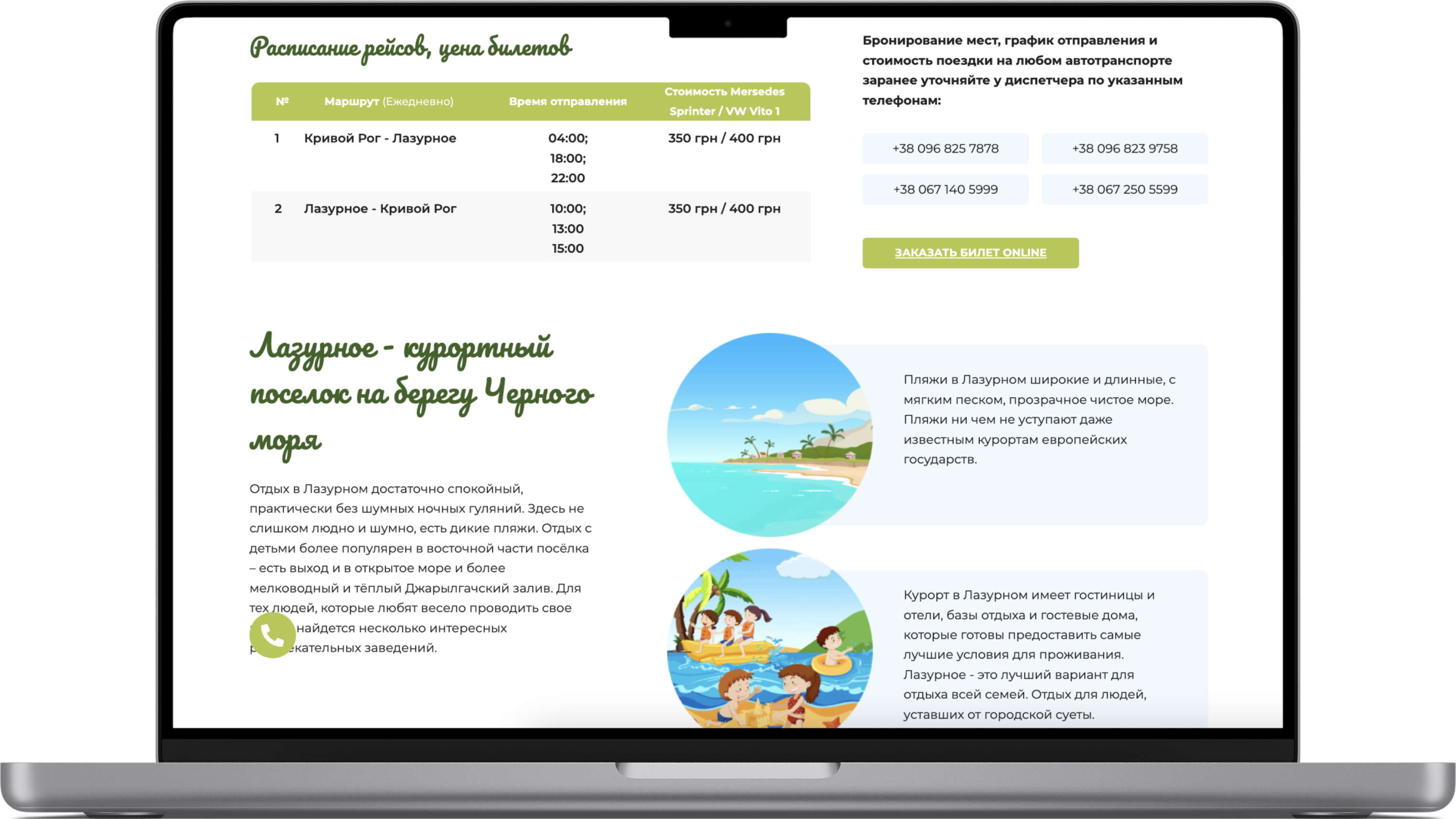
The task from the client was to create a one-page site for a transport company using the least number of technologies.
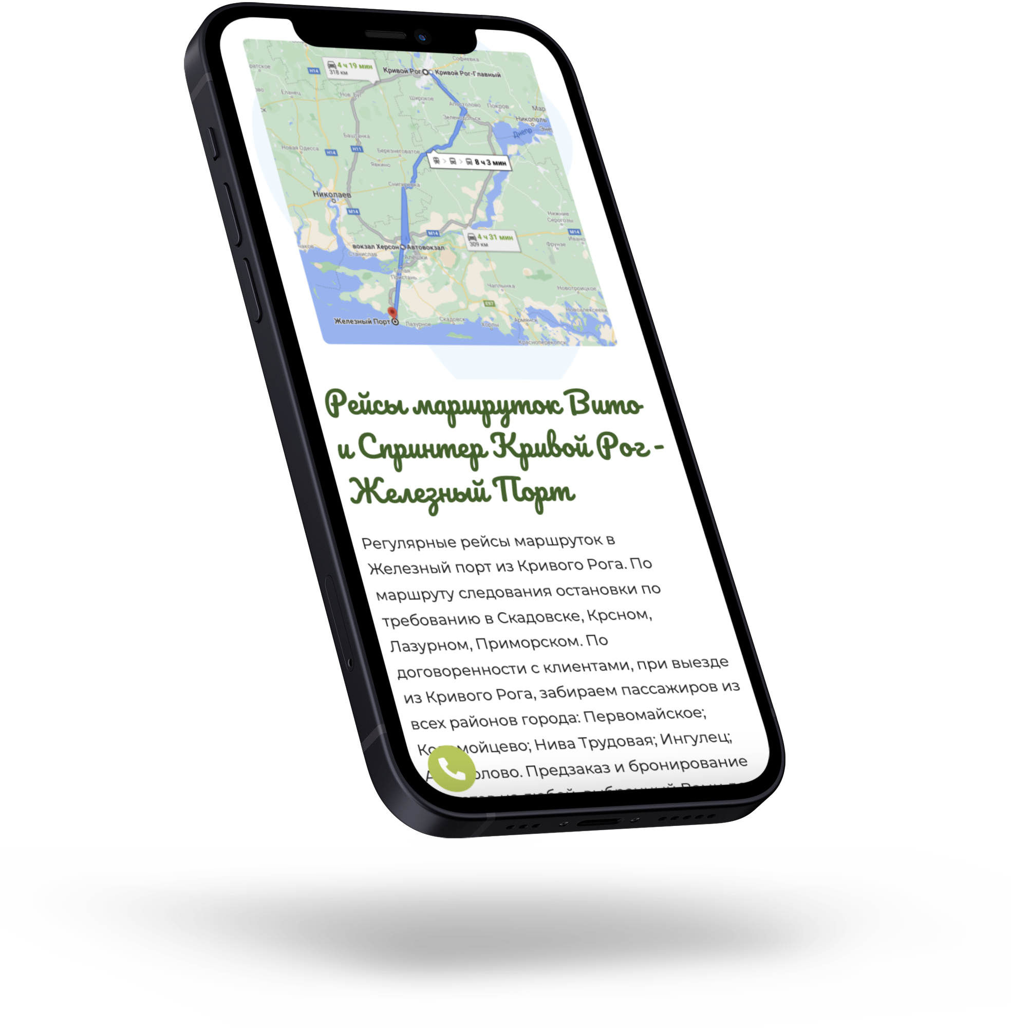
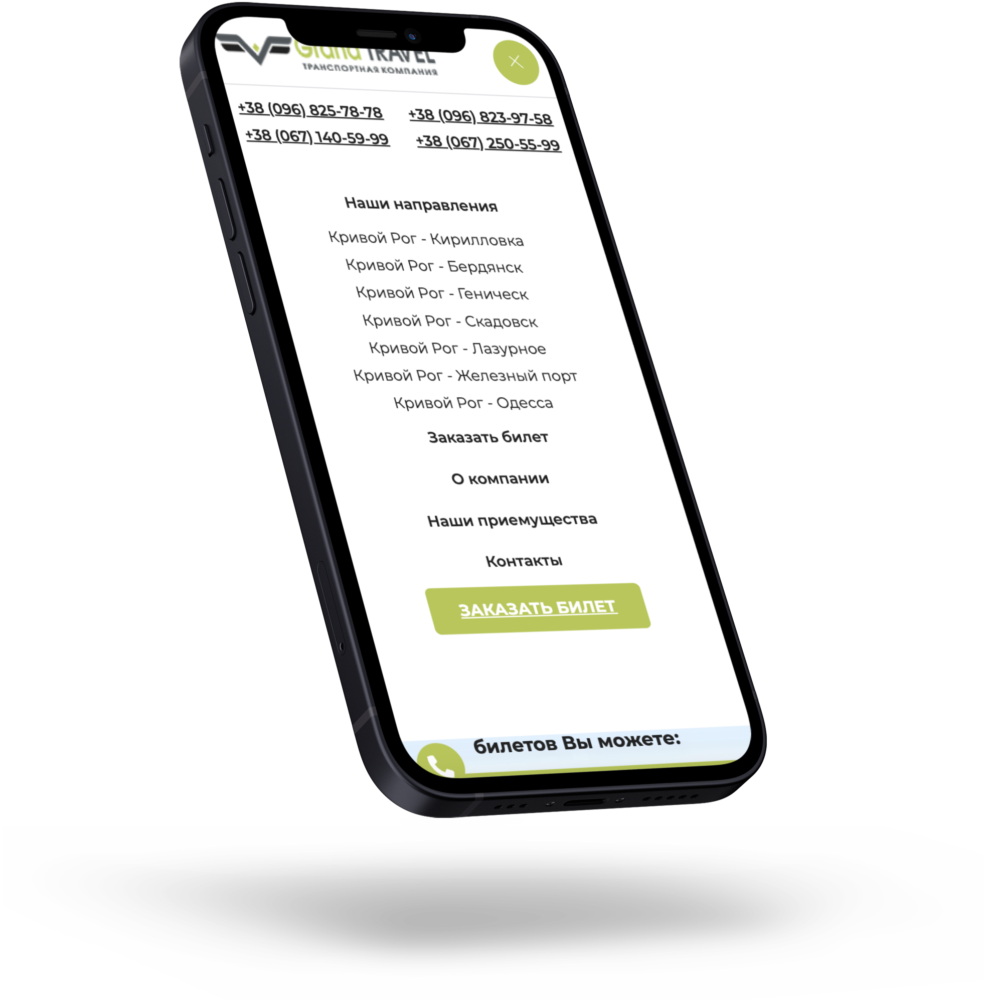
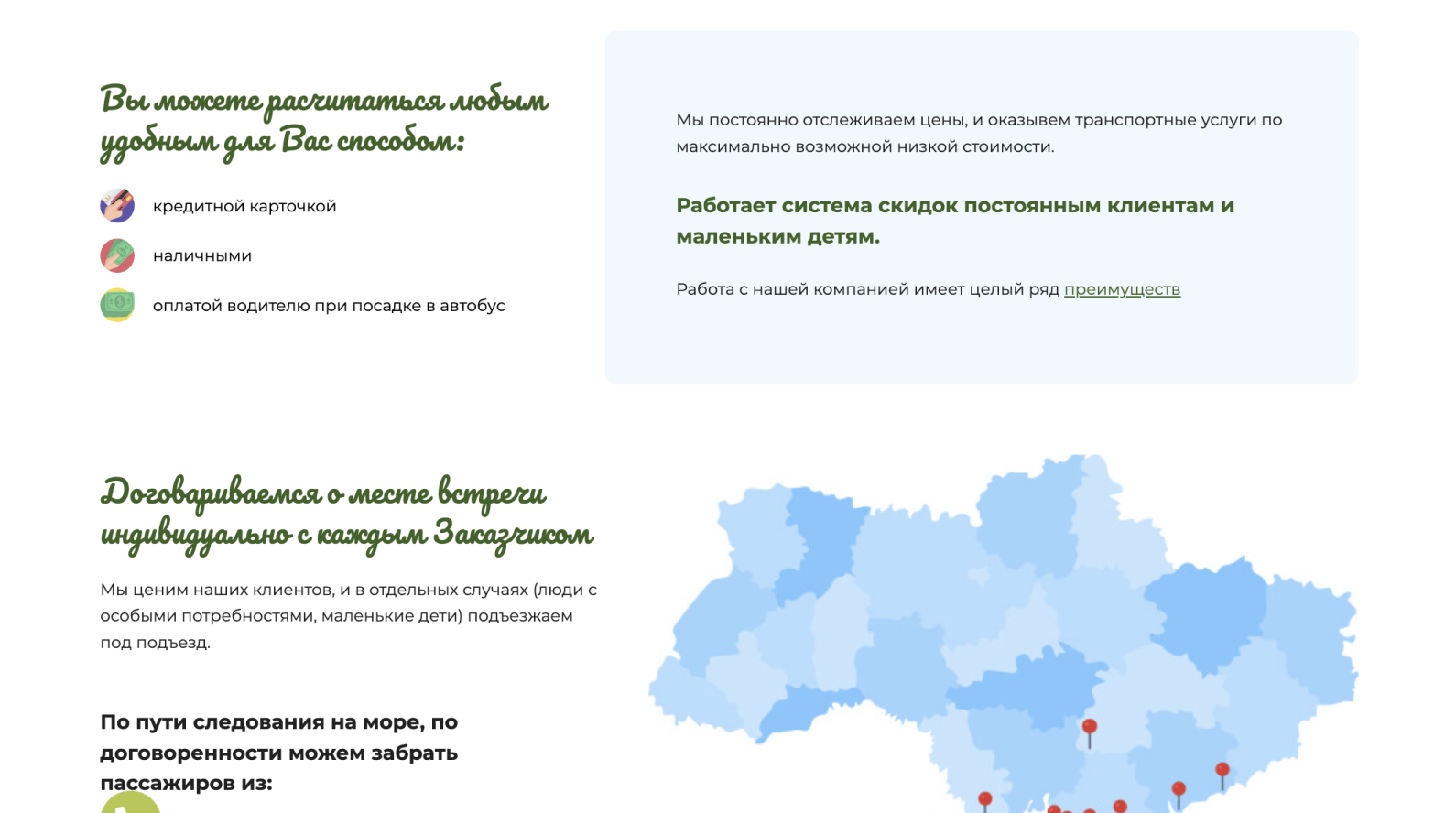
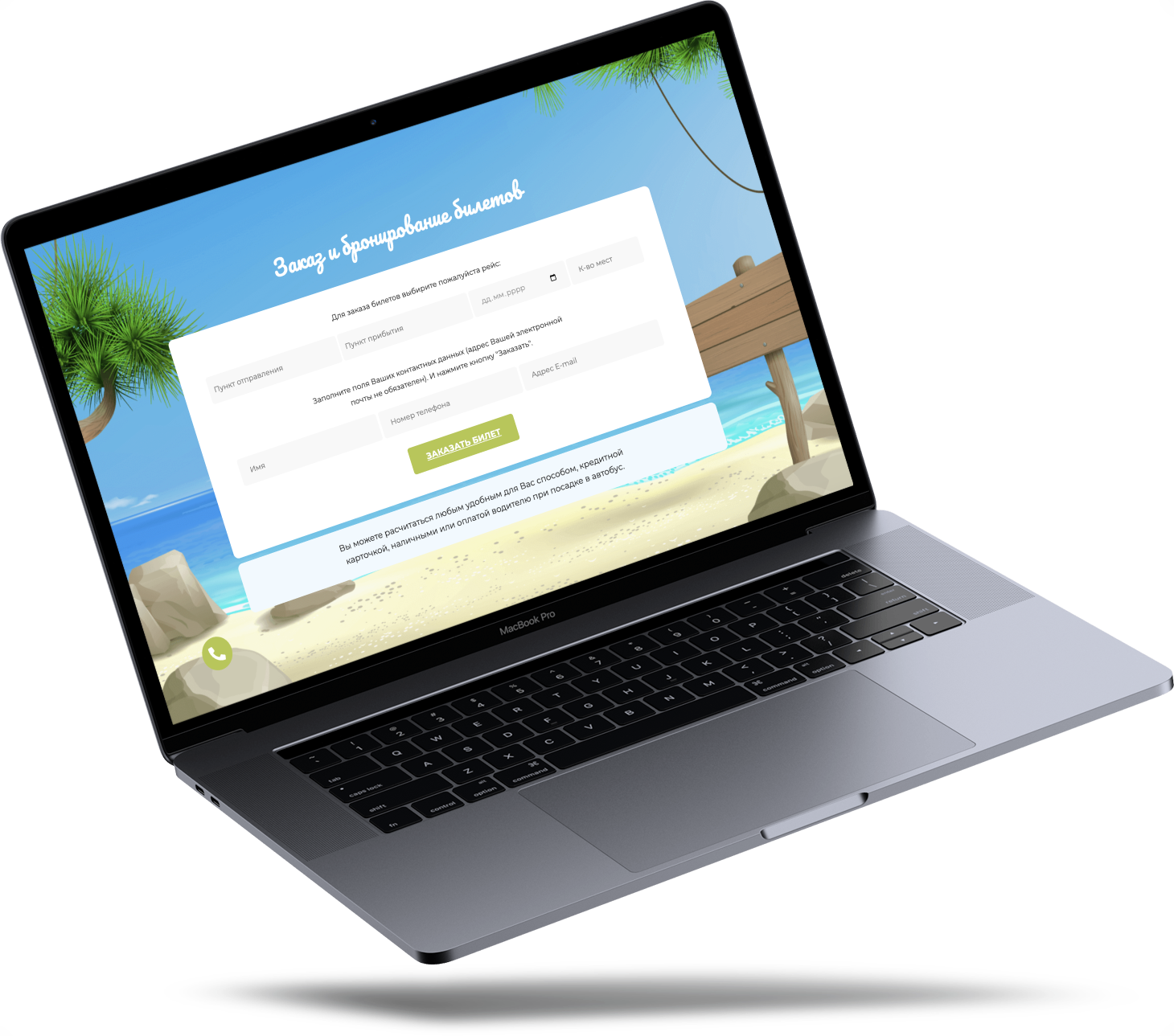
The website should have presented such blocks as a description of the company, its advantages, methods of communication, a description of regular flights, their schedule and ticket prices, ordering and booking seats, and a feedback form.
Landing for a transport company impresses with its bright color scheme, which creates a pleasant and friendly atmosphere. The site uses bright and funny images that emphasize the ease and convenience of using the transport company's services.
The site was developed, at the request of the client, using HTML, CSS and JavaScript. This provides an opportunity to create a unique design and add interactive elements to improve interaction with visitors.



You can always write to me on social networks or leave a request on the website.
You can also fill out the brief below to familiarize yourself with your future website in more detail